ggplot2 Introduction
通过数据从根本上了解世界真的是一件非常,非常酷的事情。 —-Hadley Wickham
认识ggplot2
ggplot2是Hadley Wickham写的一个very popular 的R可视化图形包,包名ggplot, 意思是the grammar of graphics(gg,图形语法)+plot(画图) +2(第三个版本,因为之前还有ggplot,ggplot1,参见:https://github.com/hadley/ggplot1 ), 嗯, 我们先来认识一下Hadley Wickham , 一个彻底改变了R的人~
网站
- 官方网站 : http://ggplot2.tidyverse.org
- Github : https://github.com/tidyverse/ggplot2/wiki
- 个人网站 : http://hadley.nz/

简介
Hi! I’m Hadley Wickham, Chief Scientist at RStudio, and an Adjunct Professor of Statistics at the University of Auckland, Stanford University, and Rice University. I build tools (computational and cognitive) that make data science easier, faster, and more fun. I’m from New Zealand but I currently live in Houston, TX with my partner and two dogs.
Hi!我是Hadley Wickham, RStudio的首席科学家,以及斯坦福大学,奥克兰大学和莱斯大学的统计学兼职教授。 我造了一些轮子(计算与认知)使得学习数据科学更加容易、快速、有趣。 我来自新西兰, 现在和我同事和两只狗狗,在德克萨斯州的休斯敦生活。
代表作
著名图形可视化软件包
ggplot2数据清洗操作整理
dplyr、reshape2、tidyr字符操作
stringr、lubricate文件操作
readr、readxl、haven、xml2、jsonlite分别对应.csv/fwf、.xls/.xlsx、sas/spss/stata、xml、json数据库
DBI爬虫
rvest软件工程
devtools、testthat、roxygen2
你可以library一个tidyverse套餐包, 多快好省
Tidyverse books : http://r4ds.had.co.nz/
library(tidyverse) # 所列出的是tidyverse的核心包 # -- Attaching packages --- tidyverse_conflicts() -- # x dplyr::filter() masks stats::filter() # x dplyr::lag() masks stats::lag() |
理念
ggplot():产生一个ggplot对象,也就是给了你一张白纸,你才可以在上面作画
ggplot的参数:ggplot(data=..., aes(...)),
data是你手中的数据(data frame对象), aes描述一个the aesthetics of the plot(作图的艺术/美学, 其实就是决定在白纸上要画些什么(x=,y=…)以及怎样画(fill,group,shape,color…))
当然geom(aes(...))也可以描述 aesthetics(只不过ggplot中的aes相当于全局的aesthetics), 因为是画图形,所以是geometric object (几何对象),比如说:
geom_bar可以画些柱子,geom_line可以产生些线条,geom_point可以造些点
stat(aes(...)则可以描述统计对象(statistcal object), 可以加统计变换
“+”表示加一个图层,类似于PS - layers ,告诉你接下来要在白纸上画些什么
这里列举了ggplot2中所有的几何对象和统计变换:
## [1] "geom_abline" "geom_area" "geom_bar" ## [4] "geom_bin2d" "geom_blank" "geom_boxplot" ## [7] "geom_col" "geom_contour" "geom_count" ## [10] "geom_crossbar" "geom_curve" "geom_density" ## [13] "geom_density_2d" "geom_density2d" "geom_dotplot" ## [16] "geom_errorbar" "geom_errorbarh" "geom_freqpoly" ## [19] "geom_hex" "geom_histogram" "geom_hline" ## [22] "geom_jitter" "geom_label" "geom_line" ## [25] "geom_linerange" "geom_map" "geom_path" ## [28] "geom_point" "geom_pointrange" "geom_polygon" ## [31] "geom_qq" "geom_quantile" "geom_raster" ## [34] "geom_rect" "geom_ribbon" "geom_rug" ## [37] "geom_segment" "geom_smooth" "geom_spoke" ## [40] "geom_step" "geom_text" "geom_tile" ## [43] "geom_violin" "geom_vline" |
## [1] "stat_bin" "stat_bin_2d" "stat_bin_hex" ## [4] "stat_bin2d" "stat_binhex" "stat_boxplot" ## [7] "stat_contour" "stat_count" "stat_density" ## [10] "stat_density_2d" "stat_density2d" "stat_ecdf" ## [13] "stat_ellipse" "stat_function" "stat_identity" ## [16] "stat_qq" "stat_quantile" "stat_smooth" ## [19] "stat_spoke" "stat_sum" "stat_summary" ## [22] "stat_summary_2d" "stat_summary_bin" "stat_summary_hex" ## [25] "stat_summary2d" "stat_unique" "stat_ydensity" |
数据集(Datasets)
Mtcars
摘自1974 Motor Trend USmagazine (所以谓之Mtcars), 其中包括32款汽车的油耗、设计和性能等。
head(mtcars) |
## mpg cyl disp hp drat wt qsec vs am gear carb ## Mazda RX4 21.0 6 160 110 3.90 2.620 16.46 0 1 4 4 ## Mazda RX4 Wag 21.0 6 160 110 3.90 2.875 17.02 0 1 4 4 ## Datsun 710 22.8 4 108 93 3.85 2.320 18.61 1 1 4 1 ## Hornet 4 Drive 21.4 6 258 110 3.08 3.215 19.44 1 0 3 1 ## Hornet Sportabout 18.7 8 360 175 3.15 3.440 17.02 0 0 3 2 ## Valiant 18.1 6 225 105 2.76 3.460 20.22 1 0 3 1 |
解释:
- name:
| sedans(小轿车) | luxury sedans (豪华轿车) | muscle cars( 肌肉车) | high-end sports cars(高端跑车) |
|---|---|---|---|
| Datsun, Ford, Honda,… | Mercedes, Cadellac,. | Javelin, Challenger, Camero… | Porsche, Lotus, Maserati, Ferrari… |
- mpg:
Miles/(US) gallon(每英里耗油量,1加仑(美制)=3.8升, 1英里=1.61公里) - cyl:
Number of cylinders(汽缸数,排量1升以下的发动机常用三缸,1~2.5升一般为四缸发动机,3升左右的发动机一般为6缸,4升左右为8缸,5.5升以上用12缸发动机) - disp: Displacement (cu.in. 排量,1立方英寸= 16.38 cm3)
- hp:
Gross horsepower (总马力) - drat: Drive shaft rear axle ratio (传动轴后轴比)
- wt: Weight (1000 lbs) (1000磅,1LBS=0.4536 KG,lb则来自拉丁语libra :scales / balance)
- qsec: 1/4 mile time (quantile, 1/4mile的加速时间)
- vs:
V/S ( 0 means a V-engine, and 1 straight engine, 发动机设计结构) - am: Transmission 变速器 (0 = automatic, 1 = manual, 自动 or 手动)
- gear:
Number of forward gears (前进挡数目) - carb: Number of carburetors (化油器数目,现已改用电喷)
Diamonds
这个数据集描述了50000多个圆形切割(round cut diamonds)钻石的价格及相关属性
price: US dollars ($326–$18,823)
carat(克拉) :
weight of the diamond (0.2–5.01)cut(切工): quality of the cut
| 理想切工 | 非常好切工 | 好切工 | 一般切工 | 差切工 |
|---|---|---|---|---|
| Ideal | Premium | Very Good | Good | Fair |
- color(颜色): diamond colour, from J (worst) to D (best)
- D级:完全无色,最高色级
- E级:无色, 仅仅只有宝石鉴定专家能够检测到微量颜色
- F级:无色, 少量的颜色只有珠宝专家可以检测到
- G—H级:接近无色, 当和较高色级钻石比较时,有轻微的颜色
- I—J级:接近无色, 可检测到轻微的颜色
- clarity(净度): a measurement of how clear the diamond is (I1 (worst), SI1, SI2, VS1, VS2, VVS1, VVS2, IF (best)),参考:GIA:What is Diamond Clarity
- FL(FLawless): 完美无暇
- IF(Internally Flawless):内无瑕
- VVS1-VVS2(Very, Very Slightly Included):极微瑕级
- VS1-VS2(Very Slightly Included ):微瑕级
- SI1-SI2(Slightly Included):小瑕疵级
- I1-I3(Included): 不洁净级
x : length in mm (0–10.74)
y : width in mm (0–58.9)
z : depth in mm (0–31.8)
depth(总深度高百分比):
total depth percentage = z / mean(x, y) = 2 * z / (x + y) (43–79)table(桌面百分比) : width of top of diamond relative to widest point (43–95)
柱状图与直方图(Bar & Histogram Charts)
首先对于x,y轴的变量来说:
| x轴数据类型 | y轴表示 | 图表类型 |
|---|---|---|
| Continuous(连续) | Count(stat_bin) |
Histogram(直方图) |
| Discrete(离散) | Count | Bar graph(柱状图) |
| Continuous | Value(stat_identity) |
Bar graph |
| Discrete | Value | Bar graph |
geom_bar与geom_histogram几何对象默认使用stat_bin这个统计变换, 会生成:
- count:每个组里观测值的数目
- density:每个组里观测值的密度
- x:组的中心位置
ggplot中生成的变量用..围起来, 比如:
- ..count.. 连续变量
- factor(..count..) 离散变量
柱状图
p <- ggplot(mtcars) dat <- as.data.frame(table(mtcars$cyl)) names(dat) <- c("cyl","count") # dat # cyl count # 1 4 11 # 2 6 7 # 3 8 14 |
## These would have the same result # p + geom_bar(aes(x=cyl,y=..count..),stat="count") # p + stat_count(aes(x=cyl)) # ggplot(dat,aes(x=cyl,y=count)) + geom_bar(stat = "identity") p + geom_bar(aes(x=cyl)) |

p + geom_bar(aes(x=cyl,fill = ..count..)) |

# ggplot(dat,aes(x=cyl,y=count,fill = factor(count))) + geom_bar(stat = "identity") p + geom_bar(aes(x=cyl,fill = factor(..count..))) |

# CHECK THE DIFFERENCES multiplot(p + geom_bar(aes(x=cyl,fill = cyl)),# NOT WORKING, coz cyl is not a factor p + geom_bar(aes(x=cyl,fill = factor(cyl))),ncol=2) # Discrete x axis |

multiplot(ggplot(dat,aes(x=cyl,y=count,fill = cyl)) + geom_bar(stat = "identity"), # cyl is a factor, p + geom_bar(aes(x=factor(cyl),fill = factor(cyl))), p + geom_histogram(aes(x=cyl, fill=factor(cyl)),binwidth = 2),ncol=3) |

# Add a black 1 size outline,fill color,bars to narrower # Remove legends,since the information is redundant # Add title, xlab, ylab # Remove default grey background theme ggplot(dat, aes(x=cyl, y=count, fill=factor(cyl))) + geom_bar(colour="black", width=0.6, size=1, stat="identity") + guides(fill=FALSE) + xlab("Number of cylinders") + ylab("Count") + ggtitle("Bar graph") + theme_bw() |

position参数额外决定了图形的排列方式, 默认参数为position="stack"(堆叠,叠罗汉),等价于position = position_stack(),以下参数同理
position="dodge"(躲避,即是不互相靠近的,并排显示,簇壮)position="fill"(填满,即按照百分比填充)position="identity"(原封不动,不作调整)position="jitter"(避免重合,随机左右晃,除非元素重叠在一起,否则请慎用,会凌乱)
d <- ggplot(diamonds) d + geom_bar(aes(x = clarity, fill = cut ),position = "stack") |

d + geom_bar(aes(x = clarity, fill = cut ),position = "fill") |

d + geom_bar(aes(x = clarity, fill = cut ),position = "jitter",width = .1) |

# Add user-defined colors(from microsoft logo , google logo) d + geom_bar(aes(x = clarity, fill = cut ),position = "dodge") + scale_fill_manual(values=c("#4285F4", "#34A853","#FFBB00","#EA4335","#00A1F1")) |

直方图
bins : 分成几组,默认为30 binwidth:组距 fill: …count…(数字)为连续变量,这个时候图例会渐变填充,factor可转为离散型变量
multiplot(p + geom_histogram(aes(qsec),binwidth = 2), p + geom_histogram(aes(qsec,fill =..count..),binwidth = 2), p + geom_histogram(aes(qsec,fill =factor(..count..)),binwidth = 2),ncol=3) |

..density..: 代替默认的..count..alpha = .3: 半透明填充geom_vline: 画一条vertical line,这里为mpg的均值
p + geom_histogram(aes(x=mpg,y = ..density..), binwidth = 2.5,color = "black",fill = "white") + geom_density(aes(mpg), color="yellow",fill = "#b2bec3", alpha = .3) + geom_vline(aes(xintercept=mean(mpg, na.rm=T)), color="red", linetype="dashed", size=1) |

分组直方图
- show.legend=FALSE: 除去图例的黑色轮廓
# Find the mean of each group tapply(mtcars$mpg, mtcars$am, mean) |
## 0 1 ## 17.14737 24.39231 |
# 0 1 # 17.14737 24.39231 mycars <- cbind(c(0,1),as.data.frame(tapply(mtcars$mpg, mtcars$am, mean))) colnames(mycars) <- c("am","mpg_mean") # am mpg_mean # 0 0 17.14737 # 1 1 24.39231 # Much simple if you use dplyr library(dplyr) mycars <- mtcars %>% group_by(am) %>% summarise(mpg_mean=mean(mpg)) # # A tibble: 2 x 2 # am mpg_mean # <dbl> <dbl> # 1 0 17.1 # 2 1.00 24.4 # Overlaid histograms with means p + geom_histogram(aes(x=mpg, y = ..density..,fill=factor(am)),binwidth=0.5, alpha=.9, position="dodge") + geom_density(aes(x=mpg, fill=factor(am)),alpha = .3,show.legend=FALSE) + geom_vline(data = mycars, aes(xintercept=mpg_mean,color = factor(am)), linetype="dashed", size=1) |

分组直方图
facet_grid参见Facet(分面)
ggplot(mtcars, aes(x=mpg)) + geom_histogram(binwidth=.5, colour="black", fill="white") + facet_grid(am ~ .) + geom_vline(data=mycars, aes(xintercept=mpg_mean), linetype="dashed", size=1, colour="red") |

折线图&散点图(Line & Scatter Charts)
- geom_point():散点图
- geom_line():折线图
由于折线图需要分组,所以我们需要将数据
宽转长或factor分组或在只有少量变量时,设定group=1,这样点才能按我们的意愿group在一起.
散点图
set.seed(1) x <- 1:5 y <- round(rnorm(20,1,10)/5)*5 g <- rep(c("A","B"),10) # Only 14 points so it must be 6 points overlapped # Handling overplotting ggplot(data.frame(x=x,y=y,g=g)) + geom_point(aes(x, y, color = g),size = 2) |

# Now we can see 20 points ggplot(data.frame(x=x,y=y,g=g)) + geom_point(aes(x, y,color = g), size = 2, position=position_jitter(width=.2,height=.3)) # Jitter range is .2 on the x-axis, .3 on the y-axis |

折线图
这里用到的是最开始的dat数据
ggplot(dat,aes(x=cyl,y=count,group=1)) + geom_line() |

# Change linetype, point type # Use thicker line, larger hallow points # Change the y-range to go from 0 ggplot(dat, aes(x=cyl, y=count, group=1)) + expand_limits(y=0) + geom_line(colour="red", linetype="dashed", size=1.5) + geom_point(colour="red", size=4, shape=21, fill="white") + xlab("Number of cylinders") + ylab("Count") |
 分组的(by groups)
mtcars$gear <- factor(mtcars$gear) ggplot(data = mtcars, aes(x = wt, y = hp, group = gear,color=gear,shape = gear)) + geom_line(aes(linetype=gear), size=1) + geom_point(size=3, fill="white") + expand_limits(y=0) + scale_colour_hue(name="Number of gear",l=50) + scale_shape_manual(name="Number of gear", values=c(15,16,17)) + scale_linetype_manual(name="Number of gear",values=c(1,2,3)) + xlab("Weight") + ylab("Horsepower") + theme_bw() + theme(legend.position=c(.8, .2)) |

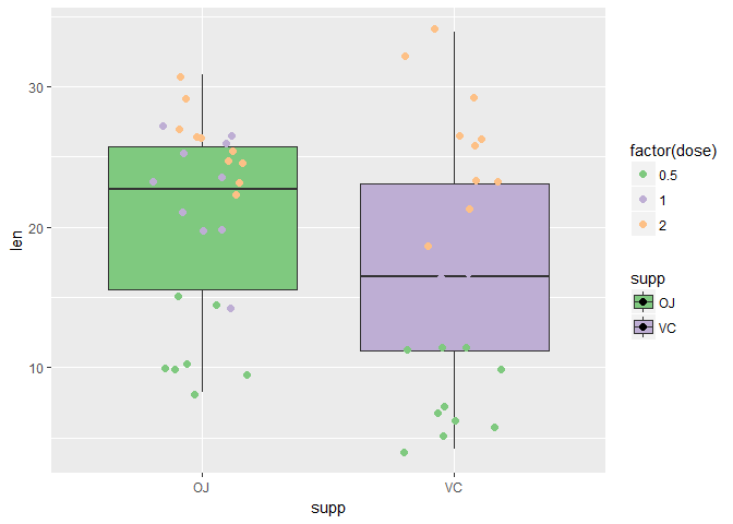
箱线图(Boxplot)
这里用一下钻石集,由于数据是实在是太多了(53940),箱线图的点太多,会看不清楚,所以随机取5000个出来,为了反映价格与颜色的相关性,取y=price/carat
先画一下散点图
set.seed(0) dia <- ggplot(diamonds[sample(53940,5000),]) dia+ geom_point(aes(color, price/carat), position = "jitter") |

dia + geom_boxplot(aes(x=color, y=price/carat)) |

dia + geom_boxplot(aes(x=color, y=price/carat),col = "purple",fill = "azure",notch = T, varwidth = T) |

dia + geom_boxplot(aes(x=color, y=price/carat,fill = color)) + guides(fill=FALSE) + # Legend removed coord_flip() # With flipped axes |

简单统计(Simple Statistics)
Summary函数
d + geom_bar(aes(x = clarity, y= price, fill = cut ),stat="summary", fun.y="mean", position="stack") |

# Using dplyr dat <- diamonds %>% group_by(clarity,cut) %>% summarise(dia.mean = mean(price)) ggplot(aes(x=clarity,y=dia.mean,fill=cut),data = dat)+ geom_bar(stat = "identity") |

Error Bar误差条
dia.model <- lm((price/carat) ~ color, data = diamonds) colors <- data.frame(color = levels(diamonds$color), predict(dia.model, data.frame(color = levels(diamonds$color)), se = TRUE)) # color fit se.fit df residual.scale # 1 D 3952.564 24.40050 53933 2008.415 # 2 E 3804.611 20.29116 53933 2008.415 # 3 F 4134.731 20.56050 53933 2008.415 # 4 G 4163.412 18.90027 53933 2008.415 # 5 H 4008.027 22.03991 53933 2008.415 # 6 I 3996.402 27.27556 53933 2008.415 # 7 J 3825.649 37.90137 53933 2008.415 se <- ggplot(colors, aes(x = color, y = fit, ymin = fit - se.fit, ymax = fit + se.fit, colour = color)) se + geom_pointrange() |

se + geom_point() + geom_errorbar(width=0.8) |

se + geom_bar(stat="identity", aes(fill=color)) + geom_errorbar(color="black",width=0.8) + coord_cartesian(ylim=c(3500,4200)) + geom_line(aes(group=1), color="black") |

Smooth平滑曲线
geom_smooth()用来给数据添加平滑曲线, 所能采用的方法包括了
- lm(linear models,线性模型)
- glm(generalized linear models,广义线性模型)
- gam(generalized additive models, 广义加性模型,for data >= 1000 points)
- loess(locally weighted scatterplot smoothing, 局部加权回归, for data < 1000 points)
- rlm(Robust linear models)
se=F:取消默认置信区间(Don’t add shaded confidence region)
fullrange=TRUE: 是否进行拟合延伸(Extend regression lines)
formula = y ~ poly(x, 2): 尝试用一元二次方程拟合, 默认是formula = y~x
pp <- p + geom_point(aes(x=wt, y=mpg, color=factor(cyl))) # Add linear regression lines pp + stat_smooth(aes(x=wt, y=mpg),se = F) |

pp + stat_smooth(aes(x=wt, y=mpg,color=factor(cyl)), method = "lm",size = 2,,se=F) |

pp + stat_smooth(aes(x=wt, y=mpg,color=factor(cyl)), method = "lm",size = 2,,se=F,fullrange = T) |

pp + stat_smooth(aes(x=wt, y=mpg,color=factor(cyl)), method = "lm",fill = "gray", size = 2, alpha = 0.5) |

pp + stat_smooth(aes(x=wt, y=mpg,color=factor(cyl),fill =factor(cyl)), method = "lm", size = 2, alpha = 0.5, se = F, formula = y ~ poly(x, 3)) |

# Group them together pp + stat_smooth(aes(x=wt, y=mpg,color=factor(cyl), fill =factor(cyl),group=1),method = "lm", size = 2, alpha = 0.5, se = F, formula = y ~ poly(x, 3)) |

Facet(分面)
| facet types | legend position |
|---|---|
facet_grid |
Right ~ UP |
facet_wrap |
UP ~ UP(default : ncol = 2) |
dd <- dia + geom_point(aes(x=carat,y=price,colour=cut))+ stat_smooth(aes(x=carat, y=price), method = "loess",fullrange = T) + scale_y_log10() dd + facet_grid(. ~ cut) #. 可省略 |

dd + facet_grid(cut ~ .) # . 不可省略 |

dd + facet_wrap( ~ cut, ncol = 3) # 不能加"." |

dd + facet_wrap( ~ cut, nrow = 3) # 堆叠的,stack by stack |

# wrap与grid 的区别,grid会显示所有组合 dd + facet_grid(color ~ cut) |

dd + facet_wrap(color ~ cut, nrow = 4) |

使用margins来描述边际图,调整scales的标度, 共有
fixed, free, free_x和free_y四种变换
dd + facet_grid(color ~ cut , margins = T) |

dd + facet_grid( ~ cut, scales = "free",space = "free") |

dd + facet_grid( ~ cut, scales = "free_x") |

reverse <- function(strings) { strings <- strsplit(strings, "") sapply(strings, function(x) { paste(rev(x), collapse = "") }) } labels <- c(`Fair` = "fair", `Good` = "good", `Very Good` ="very good",'Premium'="premium","Ideal"="ideal") dd + facet_grid( ~ cut, labeller=labeller(cut = reverse(labels))) |

REFERENCES
- http://r4ds.had.co.nz/
- https://github.com/rstudio/cheatsheets/raw/master/data-visualization-2.1.pdf
- http://www.sthda.com/english/wiki/ggplot2-essentials
- http://ggplot2.tidyverse.org
- https://github.com/tidyverse/ggplot2/wiki
- http://rstudio-pubs-static.s3.amazonaws.com/61800_faea93548c6b49cc91cd0c5ef5059894.html